Tuesday, October 18, 2011

TOO MUCH OF A GOOD THING?!

Bookmark and Share


Recently I posted a blog about a company that sells reproduction mid century ads.  Here are some more pertaining to home products.  I must admit that some of the images seem more current than I thought they would be.  Back in the 1950's and 1960's, the name of the game seemed to be "more is more" as opposed to our current lifestyle that is obsessively clean-lined and simple.

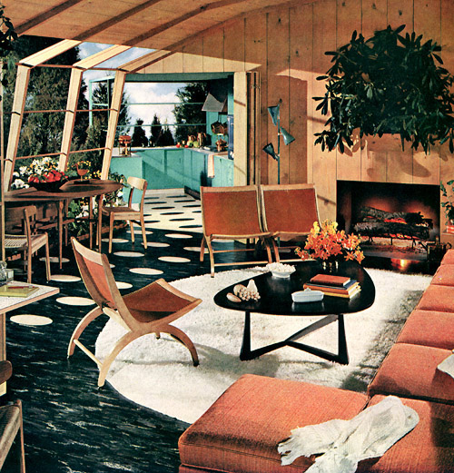
1954 ad for vinyl flooring
Some of the furnishings are very much in vogue right now
and becoming quite expensive.  The greenery on the mantle seems
to be taking over!  Vinyl flooring in the living room seems pretty scary!
Sometime between then and now, that wall panelling was
demoted to basement decor! Definitely too much of a good thing
is going on in this vignette.


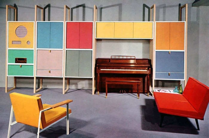
Hi-fi storage unit, 1956
Looks like a retro ad for IKEA.  This screams of "Wiggles" or another
children's tv show set!  Hmm....less is is more here...


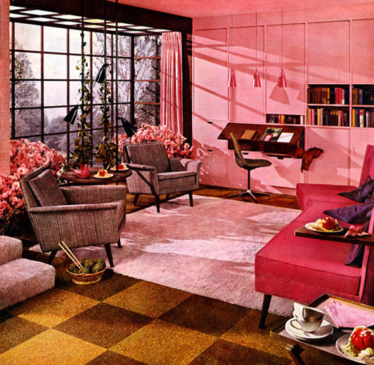
Armstrong cork tile flooring, 1956
Is the unnatural pink hue the artist's interpretation of looking through
rose coloured glasses?  The lighting and wall unit both look current and
cork flooring is really coming back into fashion.


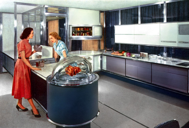
Frigidaire kitchen of the future, 1957
Wow, I could see that kitchen in today's home - well, except for that weird
rotisserie at the end of the peninsula!  It's a bit like the Jetsons meet
Jamie Oliver!


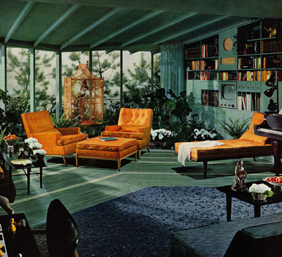
1954 ad for Armstrong cork flooring
Here is another jungle type room setting with green cork flooring to make
that natural feeling complete!  As with most of these ads, the rooms seem
so cluttered and the furnishings are so large.  Back in the 1950's, people didn't
have to worry so much about downsizing or living in pigeon hole sized dwellings.
Too much of a good thing happening in this scene as well.


No comments: